
Six Ways to Convince Website Visitors to Stay, in Six Seconds or Less
Reading Time: 10 minutesAuthor:
If you’re attracting lots of traffic to your website, then you’re off to a great start. However, you also need to convince these visitors to stay – and you only have six seconds to do it.
This may sound like an impossible task, but you can achieve a lot in just six seconds. With the right visuals, copy, and a killer Call To Action (CTA), your audience will be eager to learn more about your business.
In this post, we’ll explain why you only have six seconds or less and why it’s crucial to web design and development.
We’ll then share six ways to convince visitors that you’re the one they’ve been looking for in six seconds or less.
Let’s get started!
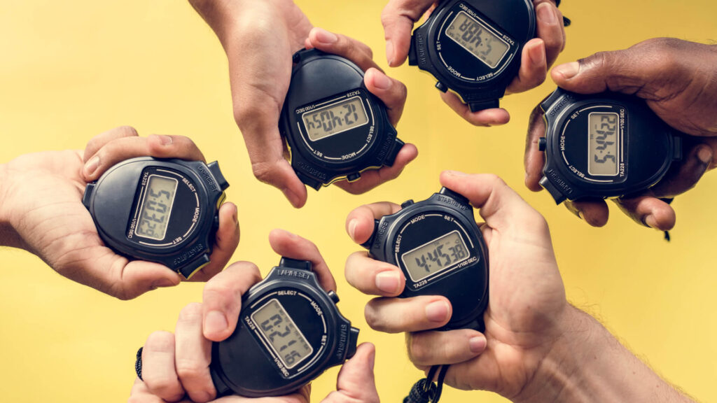
Why Six-Second or Less?
The internet has put a wealth of information at our fingertips. However, with so many videos, blogs, social media posts, and other content all vying for our attention, it’s widely accepted that the internet has impacted our attention spans.
Way back in 2015, TIME magazine famously published an article implying that humans had an attention span of just eight seconds:

While this topic is hotly debated (it’s actually a myth, but the point is no less valid), recent research indicates that attention spans have continued to shrink over the years. Now, many web designers and agencies swear by the six-second-or-less guideline. This is the amount of time a visitor is likely to spend on your site before deciding whether they want to learn more about your business.
As a website owner, you have just six seconds to convince visitors to stay. Read Six Ways to Convince Website Visitors to Stay in Six Seconds or Less. https://bit.ly/3iwfwCU Share on XDuring this brief time window, the page needs to load, and you need to confirm that the visitor is in the right place, communicate your value proposition, and signpost the next step in their journey. If you fall short on any of these points, the potential customer will most likely press the back button and exit your website.
How to Achieve Six Seconds or Less (6 Tips)

I mentioned above that goldfish are famously known for having an attention span of just nine seconds. While this belief may not be entirely accurate, it’s still pretty shocking that people visiting your website may have a shorter attention span than everyone’s favorite childhood pet.
It may be tight, but you can achieve a lot in six seconds. With this in mind, here are six strategies that can help you win over a potential new customer within a short space of time.
1. Ensure That Your Site Has Good Loading Times
Although we’re focusing on six seconds or less, it’s a bad idea to assume that you always have six full seconds to impress potential customers. If your site is slow to load, then this timescale is optimistic.
Studies suggest that 40 percent of people will abandon a website if it takes longer than three seconds to load. A modern design, compelling content, and an irresistible Call To Action (CTA) will have little effect if people aren’t sticking around long enough to encounter that content.
There are many factors that contribute to your website’s performance, but your choice of hosting provider is crucial. Get these foundations right, and you should have no problems convincing visitors to give your website a fair chance.
A fast load is the first in a series of “trust events” that have a cumulative impact on a visitor’s willingness to stay on your website. More on this later in this post.
For the best results, we recommend opting for a fully managed WordPress hosting provider:

Depending on your choice of host, you may even get access to some performance-boosting features. For example, all of Red8 Interactive’s managed plans include caching and a Content Delivery Network (CDN).
Choosing the right hosting provider can provide strong foundations for building a responsive, high-performing website. You may want to install some additional performance-boosting plugins to further boost your site’s performance.
On average, images make up almost 17 percent of a webpage’s total weight. This means that an image optimization tool such as the TinyPNG plugin or Smush Pro, which is installed on all the websites Red8 hosts and manages are must-haves.
WP Super Minify is another handy plugin that combines and minifies your CSS and Javascript files. Since there’s less code to process, you should notice a reduction in page load times.
GTmetrix is an excellent third-party tool that you can use to assess page performance. It analyzes page load performance and provides the diagnostics that you or your developer can use to fine-tune the website for optimum performance.

2. Reassure Visitors That They’re in the Right Place
The header is where the logo and navigation reside, and the hero section, the banner that appears at the top of your website, has a prime position. This combination of the header and the hero is the very first thing people see. This makes the header and hero section vital for establishing who you are (am I in the right place), what you do (how can you solve their problem), and why you can do it (reason to believe).
Essentially, you’ll use these elements to convince visitors that they’re in the right place and that they should stay:

To start, establish your brand identity by featuring your logo prominently in the header. However, remember that branding isn’t just about your logo. Many website owners use images, fonts, and colors to communicate important information about their brand.
You’ll typically use visuals throughout your website, but the hero section is your opportunity to establish this brand imagery. For example, your brand might be traditional, modern, urban, rural, or simplistic. By using images to establish this identity, you can quickly and easily communicate who you are, and why the visitor should hang around:

Remember that text can also form part of your visual branding strategy. Even something as simple as your choice of font or text color can contribute toward your brand identity or provide confusion if the fonts and colors are not what’s expected.
After establishing this tone, it’s important to maintain it throughout your content. The six seconds or less principle should be applied to every website page. Gradual and repeated exposure to a consistent brand identity helps create a sense of trust, which is important for keeping the visitor on your website.
3. Provide a Benefit-Oriented Reason to Stay
It’s tempting to fall into the trap of telling your customers what you want them to hear. However, the most successful businesses place solving customer problems at the heart of everything they do.
Your typical customer isn’t interested in an exhaustive run-through of your products or services. Instead, they want a compelling value proposition that perfectly summarizes how your offerings can benefit them:

Every piece of text across your website should be honed to perfection. However, with just six seconds to engage your visitors, the text that appears above the fold is particularly important.
To start, we recommend crafting a powerful, benefit-orientated reason to stay, one that the visitor can scan and understand in just a few seconds. Here, it’s smart to focus on clarity over cleverness.
If the customer needs to pause to try and understand your messaging, then you’re wasting valuable seconds – no matter how witty and innovative your writing:

You should also avoid the temptation to jazz up your copy with ‘hype’ words. Today’s consumer is marketing-savvy and understands that every business believes their products are the best on the market and world-beating.
If you’re lucky, then your visitors will tune out these words, and you’ve just wasted precious seconds on pointless adjectives. This is another key trust event. You don’t want your audience to perceive you as an untrustworthy business and navigate away from your website.
To keep your opening sentences compelling, we recommend targeting a specific audience. While it may be tempting to try and appeal to the masses, this often results in vague messaging. Try to appeal to everyone, and you may wind up appealing to no one.
Keep it simple. Use the PAS strategy: Problem – Agitate the problem – Solve the problem.
4. Make Their Path Clear (CTA)
By following our advice, you should have no problems convincing visitors to remain on your site. However, if they’re unsure about the next steps, then all of your hard work may have been in vain. Chances are, they’ll change their minds and navigate away from your website.
Once you have the visitor’s attention, it’s important to clearly communicate what they should do next. This is typically achieved via a Call To Action (CTA).
A CTA is an action that you want visitors to perform. This can be many different things, but some popular CTAs include signing up to your newsletter, viewing a particular product page, or clicking on that big Add to cart button:

Netflix is a great example of a website that presents a clear, compelling CTA. A quick glance at this page and you immediately understand the next step in your customer journey:

When adding your CTA, make sure to place it above the fold rather than forcing visitors to scroll. This makes it possible for people to convert within that all-important six-second window.
CTAs come in many forms, but Hubspot’s recent marketing report found that website owners are increasingly adding conversion events to their videos. Even better, Hubspot discovered that prompts that are placed at the beginning of videos drive the most conversions. This may make videos a powerful way to achieve results within seconds.
Keeping the website’s primary objective in mind when planning the CTA is key. For example, if the primary objective is confirmation, then a CTA (link) to the team page, the owner’s bio, or the About page might be appropriate. If the primary objective is conversion, then the CTA might be “Shop Now!” or “Book a Call!” Draw visitors down the path that makes sense for them and their journey, and for your business.
Want to keep the six tips handy?
There’s an infographic
5. Inspire Trust
Building a positive relationship with prospective customers is a big part of establishing your brand identity. It’s impossible to earn someone’s trust within six seconds, but attention to the six-seconds-or-less principle increases the likelihood that users stay and absorb your content; the six-seconds-or-less principle lets you lay positive foundations.
To start, we recommend displaying your company’s star rating, plus any industry awards that you’ve won. Many businesses also present positive customer feedback in an eye-catching visual format, such as pull quotes. This social proof can convince visitors that you’re a company that they want to learn more about:

Once again, infographics can communicate information about your company at a glance. Some businesses also use infographics to display their entire history in an accessible way.
While visitors are unlikely to absorb an entire infographic in just a few seconds, many of them will scan a graphic and cherry-pick the best bits. This may be enough to catch their interest, and keep them on your website way past the six-second mark:

Prominently displaying your contact information can also help convince potential customers that you’re a trustworthy business. Here, it’s important to bear in mind that different people prefer different channels.
Wherever possible, try to support multiple contact methods. This may include contacting your company via email, instant messenger, social media, live chat or even the traditional telephone number and postal address.
It’s impossible for a customer to memorize your contact details in six seconds. However, design conventions mean that most people will expect to find this information in your website’s header or footer. So don’t get cute and decide to put it somewhere else. Some visitors may scroll to this section in order to verify that you’ve made this information easily accessible. This can be a simple way to inspire trust among potential future customers and keep them on your site.
6. Make the Content Easy to Consume

As humans, we’re inherently visual creatures. In fact, half of our brain is devoted directly or indirectly to vision. The problem is that text-heavy pages aren’t particularly appealing.
When faced with a wall of text, visitors will most likely navigate away from your site, even if the messaging is spot-on. For this reason, it’s important to balance your text with plenty of eye-catching visuals.
The content that resonates with your target audience may vary. However, we always recommend avoiding stock photos wherever possible. An eye-tracking study found that internet users are highly likely to ignore this kind of off-the-shelf content. With only six seconds to grab the visitor’s attention, you cannot afford to waste time with bland stock images.
Sometimes, you may need to communicate complex information. Rather than writing a paragraph explaining how your services work, or the value your products have to offer, you may get positive results by creating an infographic. These can be a powerful way to communicate lots of information at a glance.
People are also naturally drawn to moving images. In fact, in 2020 internet users watched 12.2 billion minutes of video – that’s 23,211 years worth of content. A video or an animated gif can be a great way to catch the visitor’s attention and convey a lot of information in just a few seconds.
Broadcast Your Brilliance Boot Camp Website Audits
Nancy Juetten asked me to provide website audits for some of the Broadcast Your Brilliance Boot Camp participants. She shared the video with me and gave me permission to use it. If you would like to see the website audit in action there are some good examples shown in the video.
Conclusion – How the Six Seconds or Less Principle Improves Websites
Within six seconds, most visitors will decide whether they like what they see or not. If your website doesn’t wow your customers at a glance, then you may risk losing them forever.
This starts with performance. Is your website loading quickly. You don’t want to eat up 3 of the seconds waiting for the page to load.
Then you want to quickly reassure visitors that they’ve arrived in the right place. Don’t waste time having them wonder or wander.
To create an engaging website, it’s important to open with a strong value proposition. For the best results, try to call out your ideal customer and tailor the messaging to them rather than the masses. State the problem, agitate the problem, and then offer a solution.
Once you’ve captured your audience’s attention, a clear call to action will ensure that they know exactly what to do next. Show them the path and they will take it.
Make sure your site is stopping visitors in their tracks! Book a six-seconds-or-less website audit with our team of experienced designers today.
Related Posts
-
Using ChatGPT for Effective Landing Page Copy
See how ChatGPT provides the foundation for effective landing page copy.
-
Keyword Research – Unlock SEO
Unlock keyword research using five easy-to-follow steps.
-
Author Websites Demystified
Author website do’s and don’ts from Janine Bolan, book marketing coach and bestselling author.
Author: James Hipkin
Since 2010, James Hipkin has built his clients’ businesses with digital marketing. Today, James is passionate about websites and helping the rest of us understand online marketing. His customers value his jargon-free, common-sense approach. “James explains the ins and outs of digital marketing in ways that make sense.”
Use this link to book a meeting time with James.
